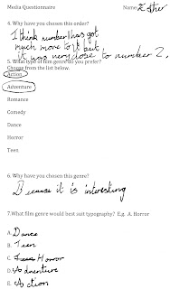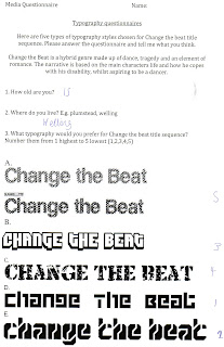

As you can this questionnaire was filled in by a 9 year old, therefore her needs are different from an average 16 or 17 year old person.In this questionnaire the participant put the the titles in order of most favourite and least favourite. Title.E. was chosen as the best typography for change the beat,whilst Title.A. was chosen as the most unsuitable.
I think that this person chose this because children like to see patterns,therefore she was more drawn to title.E &D.She mentioned that D&E were very close to each other,proving that title appeals to that market.


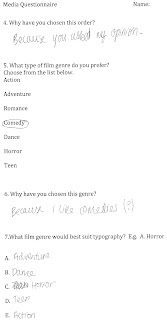
From this questionnaire you can see that what this teen prefers ,is what we would offer,which means we know our audience. This person felt that Title.E. was the best title for Change the Beat because she liked the look of the font.
This person also prefers comedies and adventure,which shows they are fun loving and adventurous and like to try out new things.I think that this show that "Change the beat" would suit them just because it has that fun,exciting aspect to it.
No comments:
Post a Comment