fiti writing.The sharp edges makes it look strong and the dark border is like the story behind the person(main character).There is a sort of movement feeling that the "Bea" typography creates, which could also portray that the film genre is dance.The lines that form the words show a form of movement and maybe a change of path. The words "Cha"in (change) are joint together and "Bea"in (beat) suggests that there are groups of dancers competing.In this film a group of dancers compete but the main character injures himself. He then goes to create his own group, although he is disabled.For example the "Change"
is competing with a separate group"Beat". "the" in between the words draws the lines as if there is two sides,which is what it suggests.
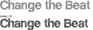
This typography looks rugged connoting the streets.This links to our street dance type of movie.The tyre prints look rough and tough,this links with dance because of the movements. This will ensure that Change the beat will be expressed in strong and street type of way in the title sequence.The crosses on the font are like lines crossing out the past.Also the way the lines cross over each other suggest that there is a different path of hope to follow.The lines overlapping also look like railings/barbed wire this denotes restriction because of the way it seems like someone could trap themselves.The holes in between the barbed wire looking font implies freedom; there is hope and an opportunity to change.